top of page

Elevating India's Online Grocery Shopping Experience with a Fresh Brand Identity.
Project Overview
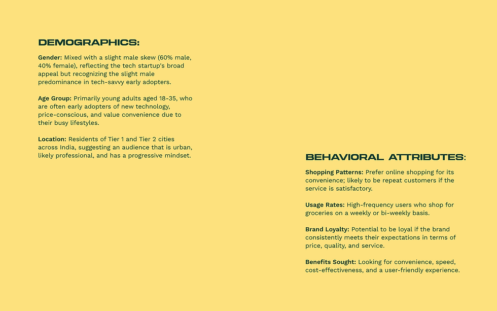
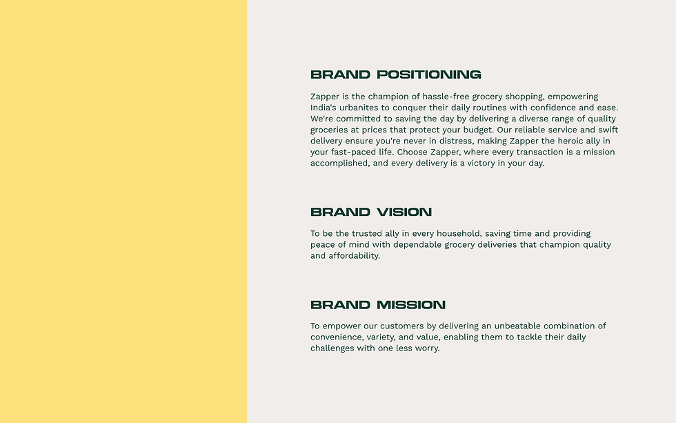
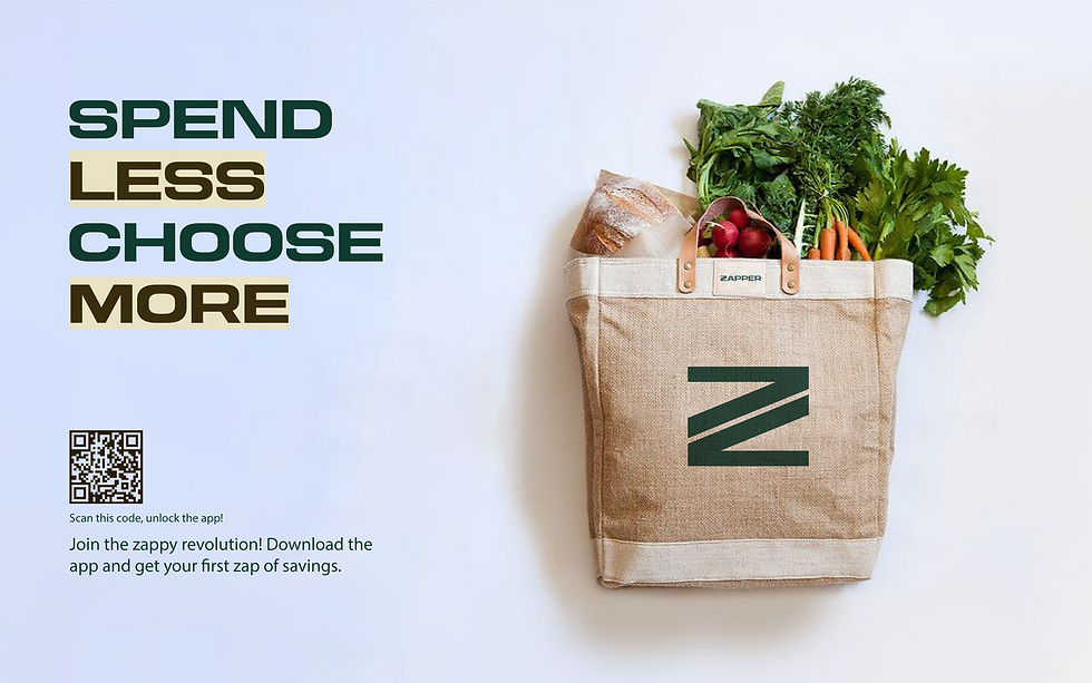
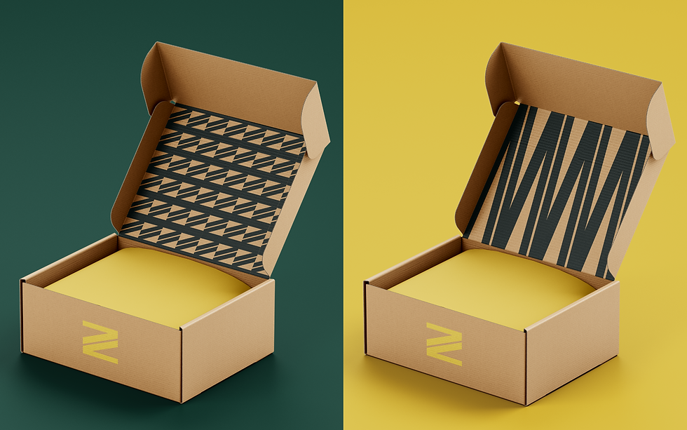
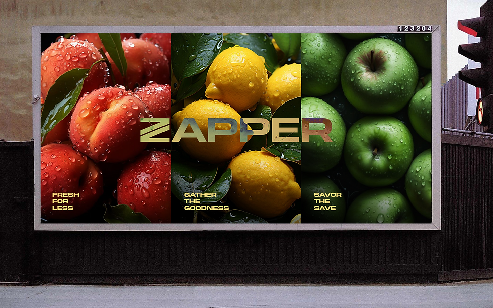
Zapper, launched in 2020 as India's flourishing online grocery platform, faced the challenge of rebranding to connect with a diverse demographic, from tech-savvy youth to budget-conscious seniors. Tasked with crafting a relatable brand experience, I redesigned its visual and narrative identity to emphasize convenience, technology, and affordability. The rebrand involved unifying Zapper's digital presence with a design that embodies its commitment to fresh, affordable groceries.



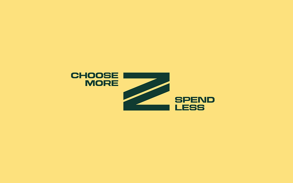
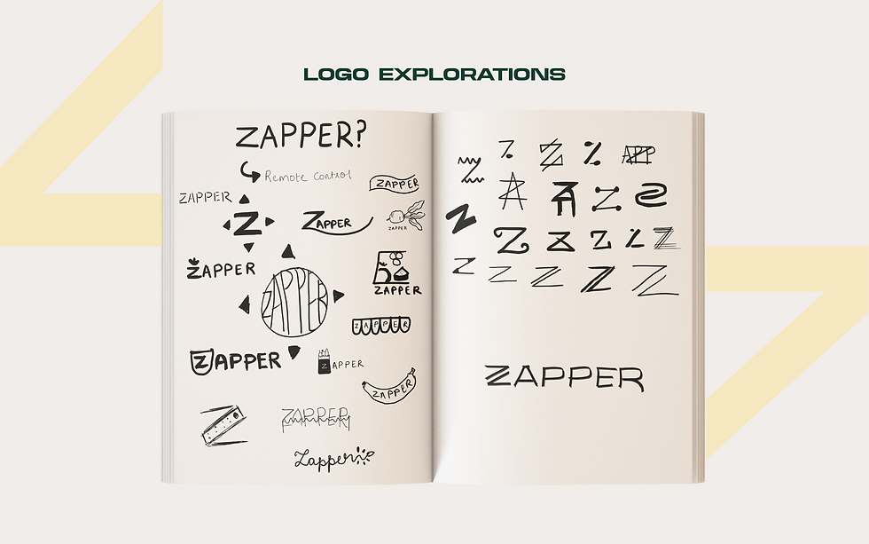


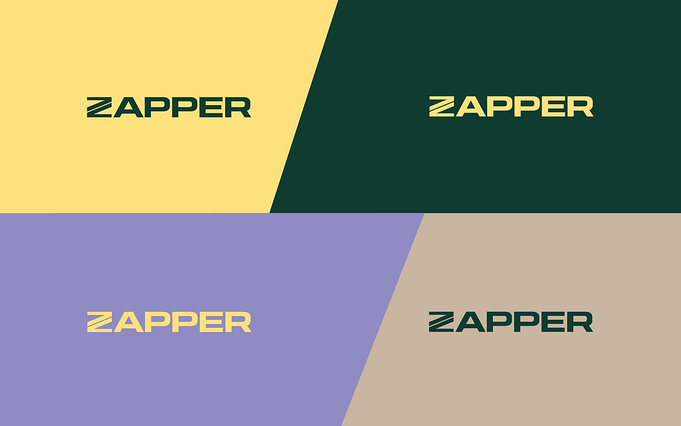
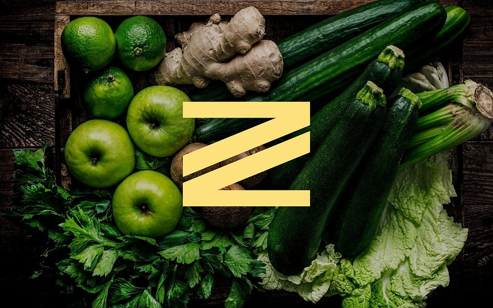
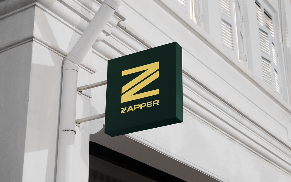
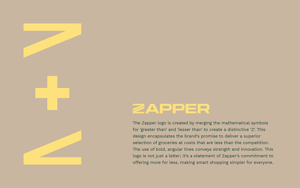
The Zapper logo is created by merging the mathematical symbols for 'greater than' and 'lesser than' to create a distinctive 'Z'. This design encapsulates the brand's promise to deliver a superior selection of groceries at costs that are less than the competition. The use of bold, angular lines conveys strength and innovation. This logo is not just a letter; it’s a statement of Zapper's commitment to offering more for less, making smart shopping simpler for everyone.





bottom of page