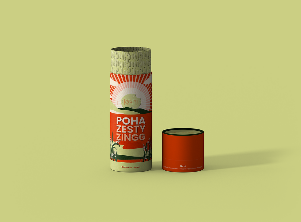
Redefining breakfast with a multi-sensory journey.

The genesis of my project lies in the pursuit of crafting a breakfast experience that resonates with the unique preferences and cultural roots of Gen Z Indians, particularly those residing in the UK. Motivated by a desire to address the challenges posed by time constraints and a shift towards health-conscious choices.
Background
The Problem
Only 3% of Indians regard breakfast as an essential meal, nearly three-quarters do not eat an adequate breakfast each day and one in four skip it completely.


What is Kachum?

The word ‘Kachum’, a term from the Kannada language I speak, forms the heart and soul of my brand. It originates from ‘Kachu’, meaning ‘bite’ in Kannada, and has evolved in colloquial use to signify the act of ‘savoring each bite’. The name Kachum itself is an echo of the sound of biting, a crisp, satisfying snap that awakens the senses to the pleasures of eating.
(Kachu)
Kachum signifies savouring each bite

Kachum embodies the Jester and Creator archetypes. This unique blend captures Kachum’s ethos: a playful, innovative approach to traditional Indian breakfasts.
Archetypes


The Logo
The “Kachum” logo features a handwritten style, intentionally embracing imperfections to resonate with Gen Z’s value of authenticity. The rough, grainy texture adds a tactile food element, while the ‘bite’ at the end playfully invites engagement, reflecting the brand’s connection to natural and wholesome food options.

Green Glow
Breakfast Blush
Minty Mornings
Saffron Sunset
Himalayan Haze


Vibrant.
Nurturing.
Whimsical.
Tone of Voice
Designing with AI
I started using AI to shape my brand vision, curious about how it could bring my ideas to life. Diving into this experiment, I played with prompts to capture my brand's heart and the look I wanted for my product. The creations from ChatGPT and Midjourney were incredibly varied, showcasing each tool's unique flair.

Texture
The texture of the cereal grain is incorporated into the cap of the packaging, allowing consumers to physically touch and experience the grain’s tactile qualities. This enhances the overall sensory experience, creating a more visceral connection with the product.
The texture of the cereal grain is incorporated into the mouth of the packaging, allowing consumers to physically touch and experience the grain’s tactile qualities. This enhances the overall sensory experience, creating a more visceral connection with the product.


The Brand Book
Kachum's brand book is a curated showcase of its unique identity. It's a visual and verbal journey that reveals the brand ethos, design philosophy, and innovative approach that sets it apart.


Design Prototype


Building Bridges:
Kachum aims to captivate Gen Z by infusing wit and humour into its social media narrative. The strategy includes posting hilarious stories and jokes that not only entertain but also subtly promote healthy living. By employing humour, Kachum intends to make the message of health more digestible and shareable, resonating with the values and communication styles favoured by this generation.


